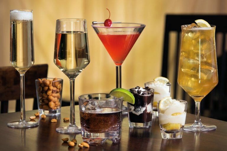
How Does Using Color With Your Plating Affect Your Food Presentation?
Here at G.E.T., we are often asked to explain how using color dinnerware can affect your food presentation. We all know that the visual appearance of your location and the food is the first and longest lasting impression your dining guests will notice. If the presentation of the food is bad, our brains will naturally tell us we should not eat it or it may not be as we had hoped. On the contrary, if the food presentation looks good, our brains believe it will taste as great as it looks and our excitement engrosses us in the full experience!
The color of the food itself is very important. However, the color of a plate it is served on also has a huge impact on how we perceive a meal. In this article, we will take a look at how different colors can affect the presentation of your food and how to best complement your cuisine with color.

Customer Satisfaction Begins with Sight
During a training class for foodservice professionals on dinnerware, we conducted an experiment that showed the visual importance of plating. Small desserts were equally divided on plates that either harmonized or distracted from the dessert. The plates were mixed up and placed around the room.
During a meeting break, the group of foodservice professionals were told to grab a dessert as a mid-day pick me up. What they didn’t know was that we were paying attention to what they chose. Not only did the majority grab the dessert on the harmonizing dinnerware, some went so far as to move the dessert from one plate to another before taking it. Once everyone was seated we explained the experiment and the results.
Overall, the experiment showed that there is more to creating satisfaction for your customers than just delivering a quality meal. All of our senses play a part in how we perceive food. Our perception begins with sight and is affected by all sensory attributes such as smell, touch, texture, and mouthfeel, all of which are a part of the overall presentation of your culinary creation.

How Color of the Plate Affects your Food Presentation
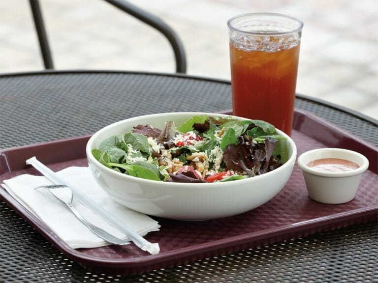
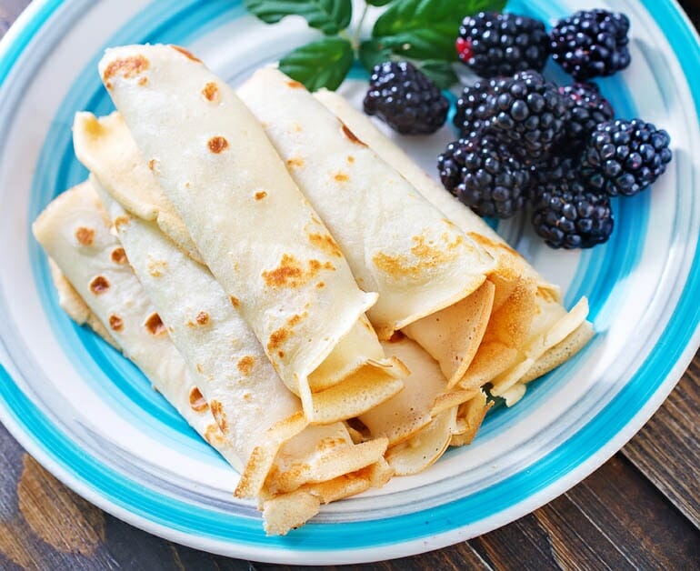
White is a top choice for many chefs for framing their culinary creations because almost every color of food looks good on white. The colors of the food seem more vibrant and the food looks more appealing. It can be a perfect frame for any style of food.
That being said, white dinnerware can also be blase’. Utilizing different shapes and textures of white tableware can help enhance your presentation and engage new senses.
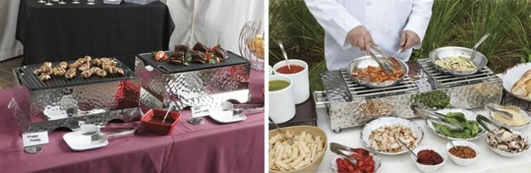
Lately, we started to notice that more and more culinary professionals choose color dinnerware to add an extra pizazz to their tabletop presentations. Some play with mixing a few different colors on the same tabletop, and even mixing different textures and materials is becoming more acceptable within the foodservice industry.
If you truly want to be memorable, the color of dinnerware can help your brand stand out. The key to using colored plating is to pick colors that support and highlight your creation instead of overwhelming and/or detracting from your presentation. Color can help you set the mood of your tabletop and truly show your guests the personality of your cuisine.

Complimentary vs. Complementary Colors
If you are looking for a harmonious effect, one trick is to stick to colors that touch each other on the color wheel. These will be complimentary colors instead of contrasting colors.
Don’t be afraid to play with complementary colors; that is, colors that are on the opposite side of the color wheel (i.e. red and green, orange and blue, yellow and purple). These colors do not just complement each other, but rather enhance or accentuate each other by creating a contrast.
For example, when you are serving meatballs with red sauce, don’t be afraid to choose green dinnerware. On the contrary, green salad in a red bowl will draw your guests eye and create a stronger presentation.
What Works with Different Colored Foods and Why
Keep in mind that we associate color to emotions and feeling. Golds, maroons, and browns are comforting, rich and warm; greens are vital and fresh; reds and oranges are powerful and intense.
In order to help, we have put together a quick reference on what works with different colored foods and why.
Beige or neutral food: chicken, potatoes, cream based pasta…
Since it is easy for these items to look bland, bring contrast to your platting while keeping the same temperature tone, i.e. cool or warm. Black or brown would offer a perfect contrast while keeping the same warm temperature tone.
Red: beef, marinara or red-based sauce, tomatoes, beets…
Red is a dramatic color and comes in a wide range of shades. Red can also be both warm and cool. Because of this, white is the perfect choice for framing your creation. Put it on a green background for an extra vivid look.
Orange and Yellow: Curried Dishes, eggs, corn…
Both are warm colors and a contrasting color in the same temperature can add drama. A bright warm blue will benefit both yellow and orange. Just make sure to keep the temperature tone warm. A cool blue could cause disharmony.
Green: pesto, salad, guacamole…
Green is a combination of yellow and blue. Since yellow and green are both warm tones and share pigment, they will harmonize well together allowing the freshness of the food to remain in balance.
Last But Not Least, Mix It Up

Using too much of one color can diminish the overall effect. Use your plating as a canvas or frame in the same way you would use garnishes and sauces to highlight your creation. Don’t forget it all starts with the menu and tone you are trying to achieve.
Now, that you have learned how using color with your plating can affect your food presentation, you may want to get inspired with some creative ways to serve fried appetizers, burger and fries, soup and sandwich, or, perhaps, sushi?